
Color Journal: Green
The color green has real pedigree. The color of cypress trees lining a gravel road in Italy, British racing green on the curve of a little sports car, chalk dusted tennis courts baking in the sun, perfectly manicured lawns stretching beyond the hedges of a country club terrace. It is cabana stripes by the pool, the thread of a monogrammed crest, the soft verdigris of weathered copper. More than just a pretty color, at Foxridge, the color green was a soft melody that floated through the halls.
Every new project we embark on begins the same way. We obsess over our clients and study them, invade their privacy with questions, try to draw out their most secret, aspirational versions of themselves. Essentially, we are getting into character to think the way they would think. We learn practical things (Where do you drink your morning coffee? Who does the laundry?) but also look for something abstract to hold as we collect evocative images that have very little to do with interiors at all. It is my very favorite part. I love it for the same reason that I love the early morning– it is all glowy in promise and ideas. So many roads are open to us then, so little reality yet to face.

In our early stages of playing and dreaming on The Foxridge House, we collected images that represented our client’s interests and personalities. All of these images turned up a very literal, unmistakable thread of the shades of green that eventually wove its way into the house, both in big ways and small. Sometimes it works that way - our guiding imagery opened up a clear and wide path for the aesthetic choices that followed, supported by the client’s love for the color itself. Our clients brought with them a distinct affinity for the color.
For him it showed up in his car collection, our favorite being an iconic vintage Porsche in a beautiful deep green.
For her it showed up in her tennis obsession and her enthusiasm for a leafy, verdant change of scenery from their previous home in Texas.
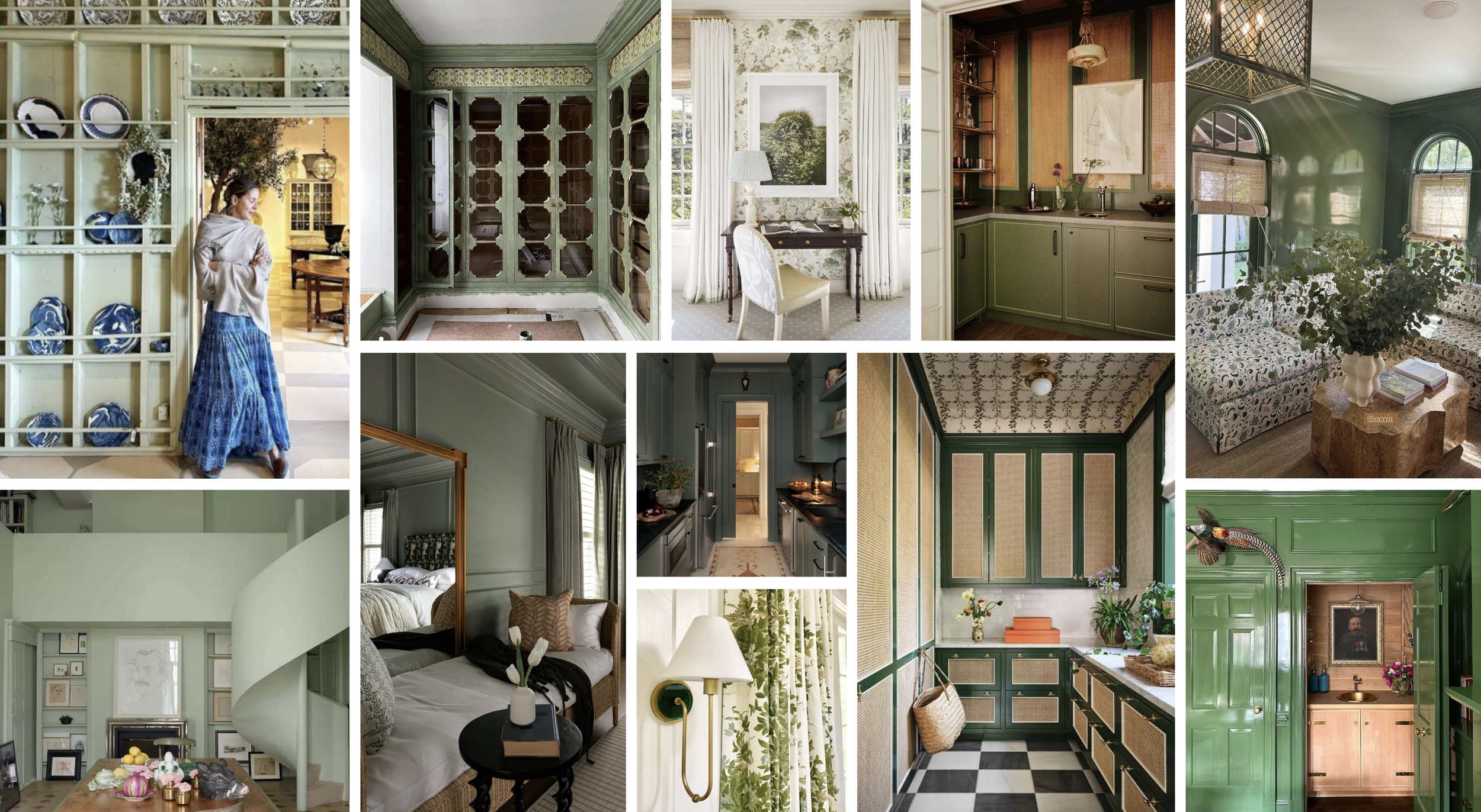
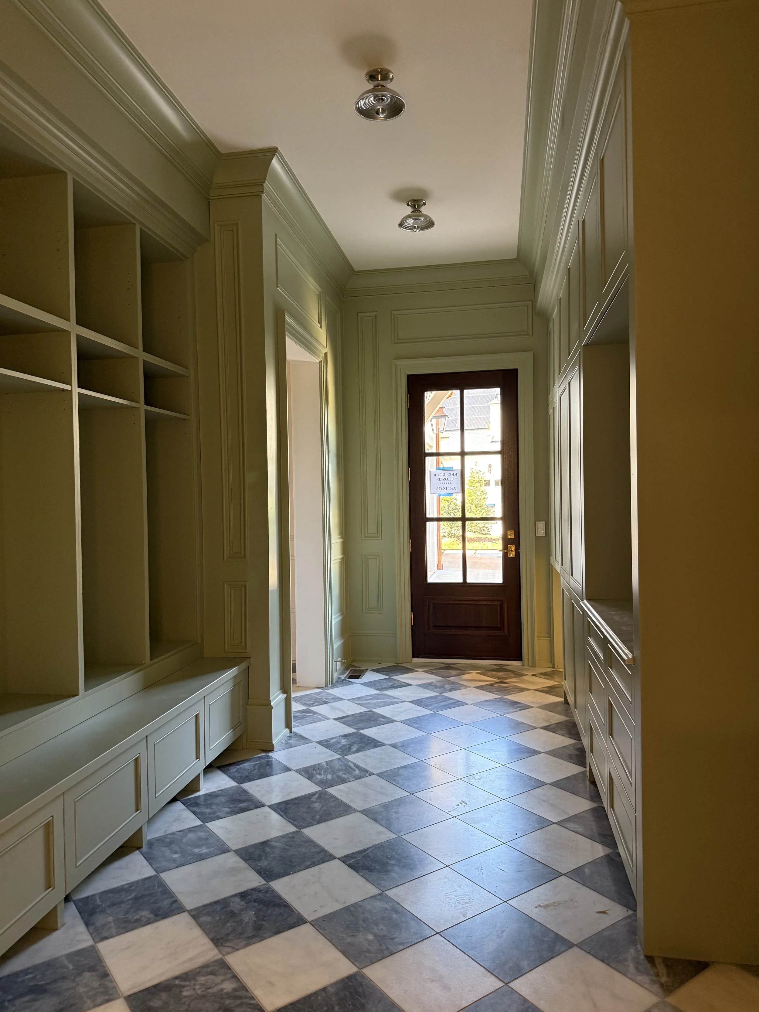
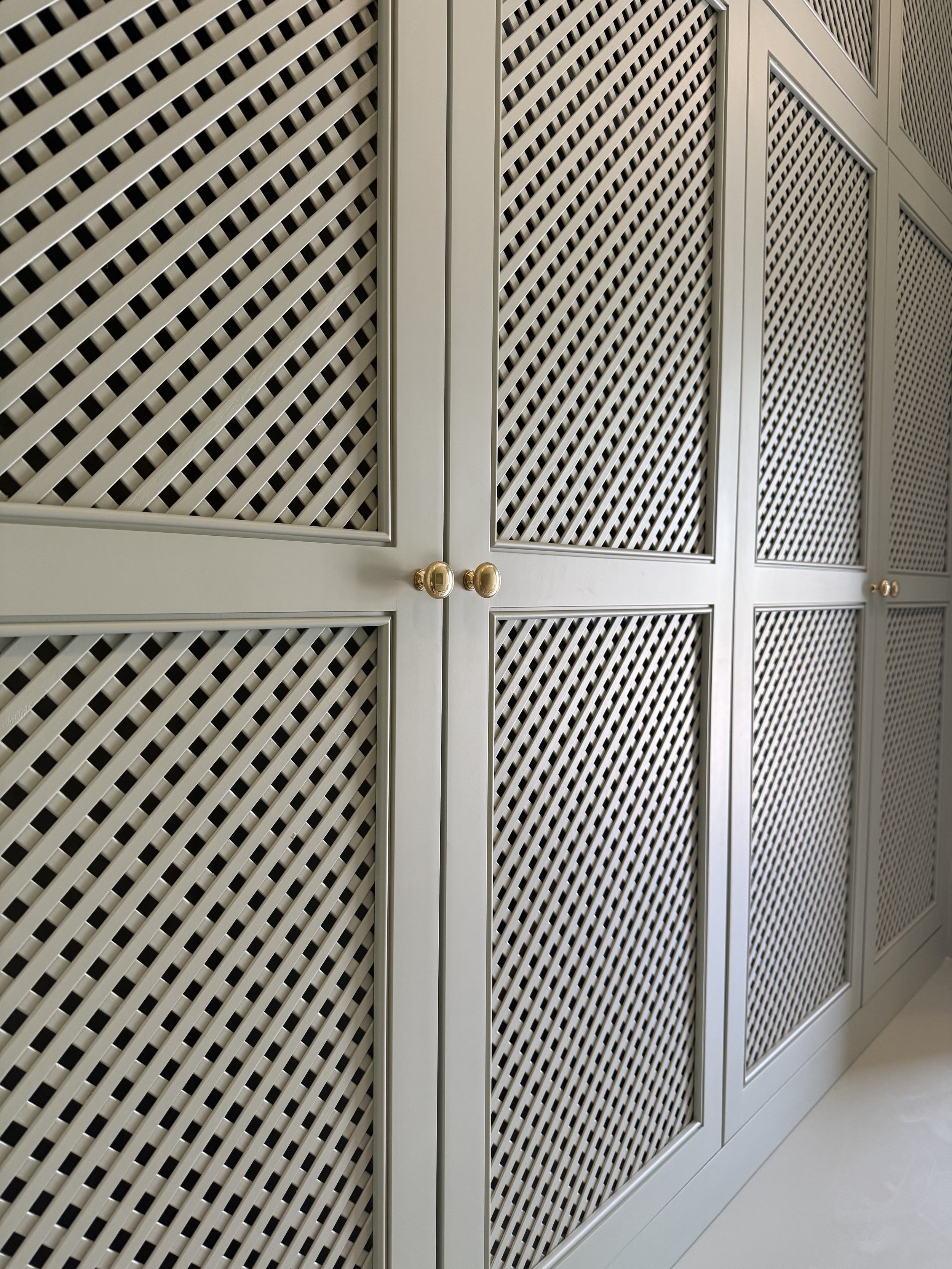
As a designer-client team alongside our friends at Frazier Home Design, we narrowed in on the particulars of this home. The European old world richness baked into the exterior really asked to be bathed in soft tones– all weathered stone, copper, cobblestone and pea gravel. Where the story swelled and deepened was with the family’s desire for a preppy, old money aesthetic. We had no qualms here – and the green theme emerged quietly as we sought the qualities aesthetically that we were after: crisp but soft, rich but grounded, tailored as well as timeless. Again and again the color made an appearance in big ways: deep, saturated green soaks the walls and custom cabinetry in the bar, which was a specific ask from our client. Verdigris colored lacquer shows up mirror-shiny on the plaster ceiling in the media room. A similar shade of the color shows up all-in on trellis front cabinetry in the mudroom. It echoes in smaller notes, too: The Santa Barbara Ikat on the living room chairs, the peacock ribbons of color in the water closet Josephine Sisal, an upstairs bath sporting a whimsical serrated stripe by Rebecca Atwood in the water closet, the Soane scrolling frond wallpaper in the little girl’s room. Whether it’s the bright neon glow of a tennis ball in sunlight, or the faded leafy shade of shutters in the South of France, we are here for all of the shades of this storied color.
At the Foxridge house, green was always more than paint and pattern. It was an aspiration—a nod to who our clients are and how they want to live. It was present from the beginning with the Porsche, the tennis court visions. It was echoed in the future verdigris of weathered copper gutters, the treelined pea gravel drive. It swelled and pooled its way through the interiors where we brought it back to play. In the end, it feels like that melody that holds the house together, note by note, until the whole place hums.
Mudroom: Softened Green, Sherwin Williams
Media Room Ceiling: GC656, Fine Paints of Europe
Fine Paints of Europe in progress

Fine Paints of Europe at the finish line. We love Loyd Builders.
Guide to Greens at Foxridge


A | Clary Sage (SHERWIN WILLIAmS)
Clary Sage is a herbal, mid-tone green that leans warm and earthy, but still light.
Undertones: It has yellow and brown undertones, which give it a grounded, organic feel—more reminiscent of dried sage leaves or olive groves than a silvery green.
Effect in a room: On walls, it feels warm, restful, and enveloping—perfect for a bedroom, where you want calm but also a sense of coziness. It nods to nature without being overly bright or fresh, more of a cultivated garden than a wild field.
B | GC656 (FINE PAINTS OF EUROPE)
Reads as a muted, silvery green. It sits in that sweet spot between sage and stone—soft and grounded, without leaning too far into warmth or coolness.
Undertones: It carries a gray base, which gives it that calm, chalky quality, and just enough yellow to keep it from feeling icy. There’s also a subtle earthy warmth underneath that makes it versatile in both traditional and modern contexts.
Effect in a room: On a ceiling, it would feel atmospheric and enveloping—like a gentle canopy of color that adds depth without overwhelming the space. It has a slightly historical, patinated quality, but still feels fresh.
C | Lawn Party (BACKDROP HOME)
Backdrop’s Lawn Party is a fresh, medium green that feels lively and confident without tipping into overly bright territory.
Undertones: It has a balanced mix of yellow and cool gray undertones, which keeps it grounded—green in its truest sense, neither too minty nor too olive. There’s a crisp clarity to it, almost like the first cut of grass in spring.
Effect in a room: On walls, it reads energetic yet approachable, bringing a sense of life and natural vibrancy. It would instantly enliven a kitchen, entry, or play space, while still carrying enough sophistication to feel grown-up in a library or dining room.
D | Softened Green (SHERWIN WILLIAMS)
Softened Green is a quiet, misty green with a distinctly gray undertone that gives it a hushed, neutral quality.
Undertones: Its base is gray with a whisper of yellow, which keeps it from feeling too cool or minty. The overall effect is soft, chalky, and desaturated—almost like lichen on stone or a faded sage leaf.
Effect in a room: On walls, it creates a calm, understated backdrop—easy to live with and versatile across styles. It works beautifully in transitional spaces like mudrooms, where you want color presence without overwhelming the eye. The muted quality makes it pair effortlessly with both warm woods and crisp whites.
E | Spanish Olive (BENJAMIN MOORE)
Spanish Olive is a muted, earthy green that leans gently into the world of taupe.
Undertones: It carries a soft beige-gray base with just enough green to feel organic. The undertone mix makes it less leafy and more mineral—almost like sun-bleached moss or weathered stone.
Effect in a room: On walls, it reads as subtle, sophisticated, and adaptable. In a powder bath, it creates a cocooning effect: warm enough to feel inviting, restrained enough to serve as a backdrop for bolder accents like brass fixtures, patterned tile, or dramatic lighting.
All the Greens we’ve loved before
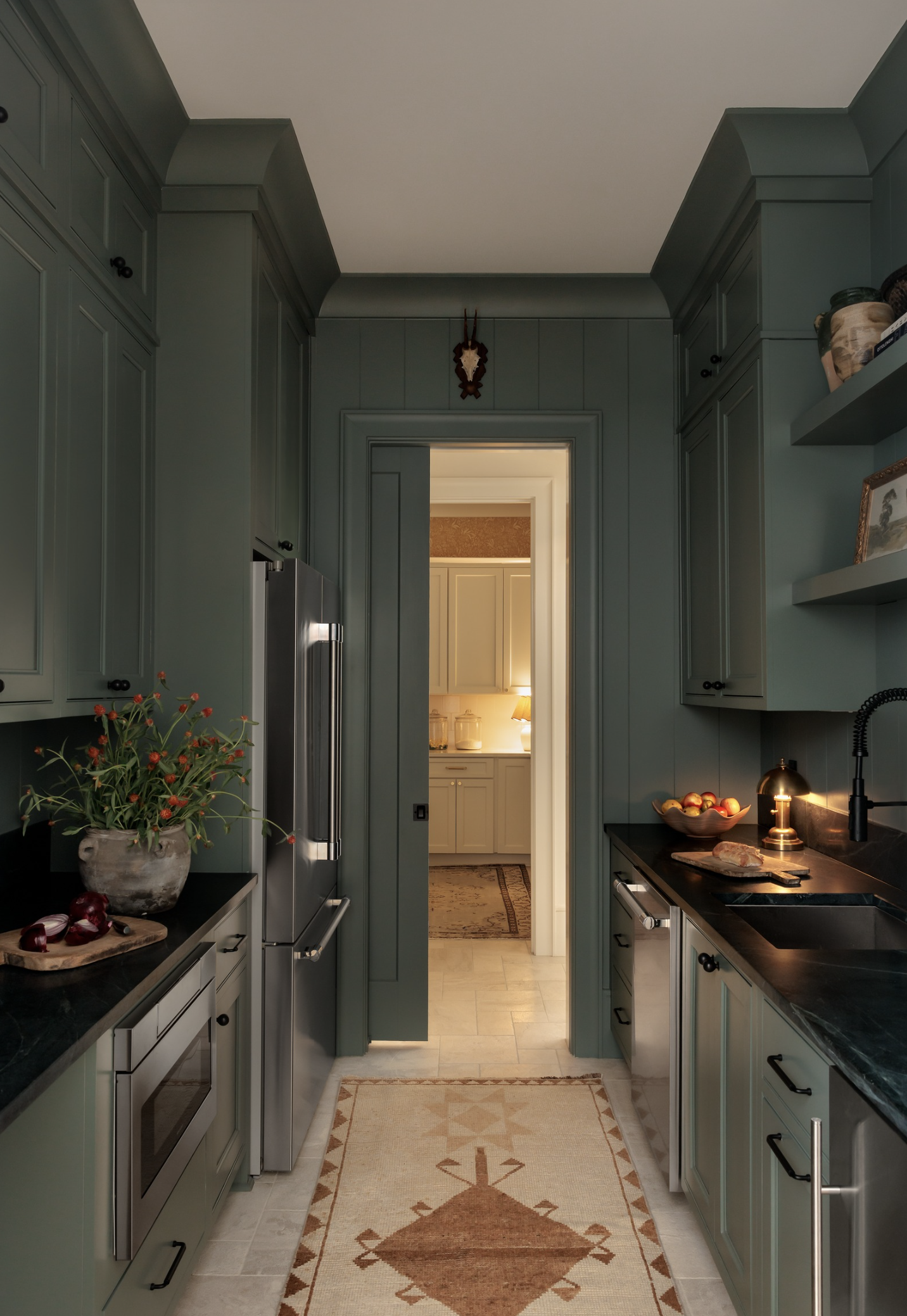
Photo: Abigail Jackson. Green: Custom. Similar: Calke Green, Farrow and Ball.

Photo: Abigail Jackson. Green: Saged, Backdrop.

Photo: Abigail Jackson. Green: Boreal Forest, Benjamin Moore

Photo: Abigail Jackson. Green: Holiday Wreath, Benjamin Moore.